Take one look at Marisol Ortega’s portfolio and you’ll notice a theme: vibrant pops of color, linework evoking both a detailed and playful technique, and a plethora of birds, other fauna, and flora. There’s a reason that Ortega—a first-generation Mexican-American designer, illustrator, and letterer—gravitates toward drawing flora and fauna. She knows that she can’t exactly draw them to perfection, but she’s inspired by the process it takes for her to reach that point.
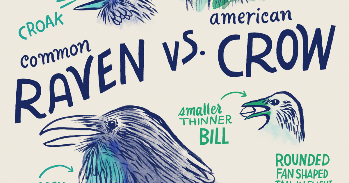
One of Ortega’s most recent bird illustrations brings to life one of our commonly asked bird questions: “What’s the difference between a raven and a crow?” Both fun and educational, her design includes key identification tips and close-ups of the species’ markers. You can find it here on apparel, tote bags, and more.
To learn more about Ortega’s process—including how she created the Raven vs Crow design—her inspiration, and more, we chatted with her on Instagram. You can watch the entire interview here. A curated version of that interview, which has been edited for length and clarity, is included below.
How did you get started with illustrating?
I’m actually a trained graphic designer, and I wasn’t really an illustrator. I didn’t go to school for it, but I just had a passion for sketching, drawing, and painting. When I was younger, I kind of used art as my therapy and exploration, just trying to draw in nature because I always wanted to do it. Then over time, I was working in-house as a designer, and I had a couple of jobs where I learned how to do illustration…and I just got addicted to it. I kept trying it out, and it took me a really long time to call myself an illustrator, just because I wasn’t feeling very comfortable because I was a trained designer. But it’s a different variation. And for me, it’s been super fun to make or draw the line between what is digital and what is hand-done. And it’s a line I like to blur and play with a lot. So that’s where my work is now.
What inspired you to illustrate wildlife and birds along with your other work?
As a kid, I went to go visit my [grandmother] in Michoacan, Mexico…She always used to sit outside and just watch the world go by, and it really made me feel like it was. I had to pay attention to my surroundings, and I would notice little things when I would stop and do that…And it really taught me to look down and up and around and be aware of things like that, to appreciate the tiny things. And so that’s what I try to do with my work. I say this when I talk to college students about my career and why I always gravitate toward flora and fauna—it’s mostly because I know that I can never draw [them] perfectly, but it’s the process of trying to get there that really ignites me. It’s how I find different mediums and how I find different kinds of combinations of things that work both digitally and hand-done. I do a lot of hand-done things and scan them into the computer and kind of digital-collage my way through it, but it still looks hand-done. So it’s never quite perfect. I can never get there, but I like to try, so that’s why I mostly stick to flora and fauna.
You note that as a Mexican-American artist, your illustrations reflect an exploration of your cultures—can you share how that inspires your art?
In essence, it’s kind of relearning what my grandmother told me—to pay attention, to look down, look up all around and really try to capture a movement, whether that be an organic brush line or watercolors or something that can tell a story and convey that feeling of what it is that I’m trying to look at. And so I feel like a lot of my work now does that. But I also like to play with a lot of colors. So it’s a bit tricky sometimes to do the less is more, but it’s more of intention and colors. That’s usually how I bring that back to my work. And oftentimes with birds, I really take liberties with the colors, but again, it’s mostly down to the details and the gestural things that really make that stand out. So like the Raven vs Crow—it was about the details and it was about the ink work and the line work. But there were elements of colors that were mixed in and super colorful and bright.
What does your artistic process look like for a project like the Raven vs Crow design you created for Audubon, or for a project generally?
Basically, what I ended up doing for this project was making sure I looked at all the reference photos and trying to find a good angle that could really make the birds feel regal. Because I wasn’t about to just downplay one and not the other. I was really trying to find the perfect position for them to feel like they had their own space. And so the side profile view is what I ended up going with. And I started doing a bunch of sketches just for overall shape. Then I started doing some indigo watercolor backgrounds on my light table. Usually what I end up doing is printing out the sketch and putting it on top of my light table with watercolor paper, and I start doing the watercolor textures. And it’s mostly just for basic shapes and letting the ink do what it does and bleed off. And then I scan it in and remove the background in the white background in Photoshop, and it’s like a digital collage. Then once I have my digital collage all sorted out, I print that out and I go back with a black brush ink, and I just start making the forms, I start doing the eyes.
For this piece, it was super important to look at the feathers…I think when I look at black birds, their plumage kind of feels like it’s all just one color. But there are many shades of that one color, right? And in the light, they look totally off and shiny. So I really wanted to make sure to bring that out. Another focal point was the eye and how it was looking at you. I really paid attention to the tiny little details, like the circles around the eyes. I thought the texture was really cool. With the details, I was doing the same thing, making sure that I was highlighting the beaks…I think the rest of the time I played with Photoshop and the composition of how I was going to do this, and I know I went through a few different iterations of the layout and making them stacked or side by side and like, “How are we going to tell whether all these facts are raven versus the crow?” So it was interesting to play with the different compositions, but still make the birds feel important.


